The Importance of Exquisite Packaging Design for Lying Flat Aesthetic Products
As a mentor who has watched dozens of print‑on‑demand and dropshipping brands grow from zero to consistent six‑ and seven‑figure revenue, I can tell you this bluntly: your packaging is not a cost center; it is one of your fastest levers for growth or churn.
This is even more true for what I’ll call lying flat aesthetic products: calm, visually curated lifestyle goods that are designed to look beautiful when laid out on a table or photographed from above. Think art prints, stationery, skincare, candles, and home objects that live inside “flat lay” photos on social feeds and product pages. For these businesses, exquisite packaging is both a sales argument and a content engine.
Research from packaging specialists and consumer‑insight firms backs up what founders see anecdotally. Nielsen data cited by Fresh‑Lock reports that 64% of consumers try a new product because the packaging grabs their attention and 41% keep buying it because they prefer the design. Other studies summarized by Fresh‑Lock and Pandh show that around 70% of people form an impression of a brand from packaging alone, and more than 70% of Americans say packaging significantly impacts what they buy. When you operate in a category where much of the experience is visual and emotional, ignoring packaging is essentially ignoring revenue.
In this article, I will unpack why exquisite packaging design matters so much for lying flat aesthetic products, how the psychology works, and how to design packaging that supports a lean on‑demand or dropshipping operation without killing your margins.
What Are Lying Flat Aesthetic Products?
Lying flat aesthetic products are those that are bought as much for the feeling they create in a scene as for their functional job. Customers picture them on a nightstand, a desk, or a coffee table. They imagine photographing them from above and posting that image. In many of the brands I mentor, this includes:
Art prints and posters that arrive ready to be laid flat and styled.
Journals, planners, and stationery sets that live in desk flat lays.
Beauty, wellness, and fragrance products that are photographed on bathrooms and vanities in carefully arranged compositions.
Soft home goods such as throws, cushions, or folded apparel that form part of a relaxed, minimalist vignette.
The common thread is that the product is part of an aesthetic narrative: a slower, calmer, more intentional lifestyle. When the object arrives in a cheap, noisy, or inconsistent package, it breaks that narrative. When it arrives in packaging that looks and feels like the lifestyle the customer bought into, it deepens the bond and creates content that customers are proud to share.
That is where exquisite packaging becomes a strategic asset rather than decoration.

Packaging as a Silent Salesperson in a Scroll‑First World
Packaging has long been described as a “silent salesman.” Research summarized by DataLase and the cosmetics review published on PubMed Central emphasizes that packaging acts as a brand ambassador that attracts attention, communicates quality, and differentiates a product on the shelf when shoppers have only a few seconds to decide. One study cited in that review found that around 70–73% of purchase decisions are made at the point of sale and that visual stimuli account for a large share of the brain’s processing, which is why immediate differentiation matters so much.
For lying flat aesthetic brands, that sales moment now happens in two places: on a physical shelf and on a digital screen.
Offline, you may still have your prints, candles, or skincare on a boutique shelf. There, the rules from consumer packaged goods research apply. Studies reviewed by Creative Packaging researchers show that shoppers spend roughly seven seconds on a product before deciding whether to consider it. Packaging that looks cheap, cluttered, or off‑style simply does not enter the consideration set.
Online, something similar happens in the scroll. A thumbnail of your product in its packaging, a lifestyle photo in which the packaging appears, or an unboxing video on a social feed is often the first impression. Fresh‑Lock reports that about one‑third of product decisions are based solely on packaging. That figure translates surprisingly well into digital behavior: people will often save, click, and share based on how the pack looks, even before they read the copy.
That is why in my work with print‑on‑demand founders, I treat packaging artwork as a front‑end marketing asset, not a back‑end operational detail. It has to sell in three contexts simultaneously: the shelf, the product detail page, and the flat lay.
The Psychology Behind Exquisite Packaging
Behind every “this looks beautiful, I want it” reaction is a stack of predictable psychological triggers. Understanding them helps you design packaging that supports your lying flat aesthetic rather than fighting it.
Color as Your Fastest Lever
Multiple sources, including Pandh and Kadence, point to color as the single most influential visual cue in packaging design. Research cited by Pandh suggests that around 90% of snap purchase decisions can be influenced by color, and that people form their initial impression of a product largely from its color palette.
Common associations appear again and again across the research:
Green often signals health, nature, and sustainability. DataLase and Komori’s summaries of color psychology highlight how green packs align with eco‑friendly or wellness‑oriented offers.
Black tends to communicate luxury, exclusivity, and power, making it a go‑to for premium beauty and lifestyle goods.
Red creates urgency and excitement. DataLase notes its frequent use in promotional packaging and snacks that lean on energy and appetite.
Blue is associated with calm, trust, and reliability, which is why it shows up heavily in healthcare and financial categories, according to Kadence and other sources.
For lying flat aesthetic products, the challenge is to select colors that fit both the brand promise and the desired mood of the scene. Many of the “lying flat” brands I see on Etsy‑style marketplaces favor muted neutrals, soft blues, or warm earth tones that photograph beautifully on wood or linen. The mistake is when founders choose colors only for current trendiness and ignore category codes. A minimalist skincare brand in a dusty beige box that looks indistinguishable from a stationery set, for example, might confuse shoppers. Better to borrow enough color meaning from your category to signal what you are, then reinterpret it in your aesthetic language.
Typography and Layout: Quiet Clarity vs Visual Noise
Typography is another pillar of perception. The DataLase and Kadence sources both emphasize that font style, weight, and placement communicate personality: bold, geometric sans‑serif fonts feel modern and innovative; classic serif fonts evoke heritage and trust; playful scripts speak to youthfulness and whimsy.
There are a few consistent lessons that apply strongly to lying flat aesthetic products.
First, legibility wins. Meyers, in its packaging design guide, stresses that typography must be readable at a glance, on shelf and on screen. When I review designs for new founders, a common issue is micro‑type that looks chic on a mockup but disappears in real‑world photos and mobile thumbnails.
Second, hierarchy matters. Good layouts tell the customer, in order, who the product is from, what it is, and why it is right for them. Fresh‑Lock talks about packaging needing to answer “who am I, what am I, and why am I right for you” very quickly. For a lying flat product, your brand name, product name, and one key benefit or emotional hook should be easy to read even in a flat‑lay shot shared on social media.
Third, typography style should align with the emotional promise. A calm, “lying flat” lifestyle product with hyper‑aggressive condensed type or neon highlights would feel jarring. In contrast, a clear, airy type system with enough breathing room will reinforce the idea of spaciousness and rest your brand is trying to sell.
Materials, Texture, and Structure: How It Feels in the Hand
The cosmetics packaging review from PubMed Central, along with insights from BoxMaker and Pandh, all underline the same point: materials and structure heavily influence perceived quality and ethics. Glass bottles convey elegance and permanence but add weight and fragility. Plastics dominate many categories due to low cost and versatility but raise questions about environmental impact. Matte finishes and embossing signal premium positioning; flimsy or overly glossy substrates often feel cheaper.
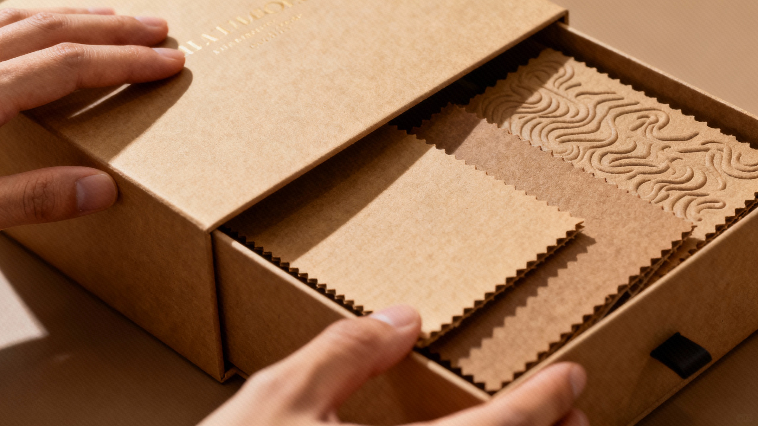
Even if your lying flat product is shipped in a simple mailer, these material signals still apply. Sturdy rigid mailers for art prints, kraft paper wraps for journals, and textured board boxes for candles all communicate that the contents are worth protecting.
The tactile experience is not just nice to have. Pandh cites examples such as Apple and Tiffany & Co., where the box itself has become a symbol of luxury and romance. When customers share unboxing videos, it is the slow lift of a lid, the feel of a soft‑touch coating, or the reveal of a perfectly printed insert that sticks in viewers’ minds. That is content your media budget did not have to buy.
From a lying flat perspective, structure also affects how products sit in a scene. A shallow, rigid box that opens fully and lies flat, a sleeve that pulls off cleanly, or a mailer that can double as a photography backdrop all make it easier for customers and influencers to feature your packaging in their content.
Imagery and Minimalism: Telling the Story Without Clutter
Kadence and Creative Displays Now both point out that images and icons on packaging serve two jobs: they show use context and they tell the brand story. For lying flat aesthetic products, this is where many brands overdo it. They fill the front panel with lifestyle images or collage graphics that feel busy when photographed from above.
The more your brand leans into a quiet or restful aesthetic, the more discipline you need. Minimal imagery, a single well‑chosen symbol, or a subtle line drawing often performs far better in flat lays than a complex scene. The key is to make sure that whatever you do show is honest to the product. Packaging specialists such as APlus Products repeatedly warn about the damage caused by misleading images that promise more than the product delivers. For a dropshipping brand that cannot fully control every detail of the supply chain, keeping imagery accurate is part of protecting trust.
Why Packaging Matters Even More for On‑Demand and Dropshipping Brands
Brick‑and‑mortar brands at least benefit from context. Shoppers can pick up the product, compare several options side by side, and ask store staff for help. On‑demand and dropshipping brands rarely have that luxury. The first physical contact between your customer and your brand is the package that lands on their doorstep.
Several findings from the research are especially relevant here.
Fresh‑Lock reports that roughly 70% of people form an impression of a brand based on packaging alone. Pandh notes that 72% of Americans say packaging has a significant impact on what they buy. DataLase emphasizes the rise of the “unboxing experience” as a marketing asset in the age of social media, where thoughtful packaging can generate user‑generated content and organic acquisition.
For print‑on‑demand and dropshipping businesses, this means your packaging has to shoulder jobs that would otherwise be handled by retail merchandising, store staff, and physical brand experiences. It has to:
Reassure the customer that they bought from a real, thoughtful brand, not a random listing.
Deliver the product in excellent condition despite often complex shipping routes.
Align with the values and aesthetic your ads and product pages promised.
Encourage the customer to come back, or at least to post and tag you.
Trust, Perceived Value, and Price Realization
Pandh’s work on packaging psychology highlights that attractive, premium‑looking packaging can persuade shoppers to favor a product and pay more even before they have tried it. Iconic examples include Tiffany’s blue box and Apple’s minimal white packaging, which have both become shorthand for quality and exclusivity.
Fresh‑Lock notes that about 30% of businesses report revenue increases after improving packaging, and Nielsen data shows that 41% of consumers keep buying a product because they prefer its packaging design. That is repeat revenue driven by cardboard, ink, and thoughtful decisions.
In the lying flat aesthetic world, this manifests in customers being willing to pay a premium for a journal that arrives in a rigid box they can keep on their desk, or an art print that comes with a branded backing board and tissue wrap instead of a barebones tube. It is not just indulgence; it is risk management from the shopper’s point of view. Premium packaging signals that the brand invests in the product and will likely stand behind its quality.
Values, Sustainability, and The Risk of Getting It Wrong
Consumers are not only buying aesthetics; they are buying alignment. Fresh‑Lock cites a Harris Poll indicating that about 82% of shoppers want a brand’s values to match their own, and around three‑quarters have stopped buying from a brand over value conflicts. The Global Sustainability Study 2021, also cited by Fresh‑Lock, found that 85% of people have shifted toward more sustainable buying behavior over the last five years.
Packaging sits at the intersection of these values. McKinsey’s work on packaging sustainability shows that many consumers say they are willing to pay more for sustainable packaging and that, in many segments, they are comfortable with a premium of up to around 5%. At the same time, McKinsey notes that sustainability still ranks only fifth or sixth in the hierarchy of buying factors, behind price, quality, brand, and convenience. In practice, this means you cannot ignore sustainability, but you also cannot assume that a green message will compensate for poor product‑market fit or weak usability.
From an operations perspective, McKinsey’s interviews with packaging leaders show that shifting from virgin to fully recycled material in certain formats may only require a 1–2% increase in retail price to cover costs, which falls inside the willingness‑to‑pay band many consumers report. For a small on‑demand brand, this can be a rational investment: you gain differentiation and value alignment without destroying your unit economics.
The risk lies in confusing or betraying your audience. The Tropicana case described by Kadence is a cautionary tale: a 2009 redesign that removed the brand’s iconic orange‑with‑straw visual led to about a 20% sales drop in two months, and only when they reverted did sales recover. The lesson for lying flat aesthetic brands is that radical packaging shifts that ignore core brand cues or values can hurt, even if the new design looks more fashionable.
A Practical Framework for Exquisite Lying Flat Packaging
Theory is helpful; founders need a roadmap. Here is a practical way I advise on‑demand and dropshipping entrepreneurs to approach exquisite packaging for lying flat aesthetic products, grounded in the research above and in real projects I have seen succeed.
Clarify the Product, the Buyer, and the Channel
Before sketching anything, define three things in plain language.
First, describe the product in functional terms: what size it is, how fragile it is, and whether it needs to lie flat in transit. An art print or notebook may need rigid support; a candle needs impact protection and leak resistance; skincare must manage hygiene and shelf life.
Second, describe the buyer in human terms: their age range, disposable income, and especially their emotional drivers. Research from Pandh and Thundertech shows that packaging taps into feelings such as nostalgia, comfort, and luxury. Are you selling calm and escape to an overworked professional, or empowerment and creativity to a college student? The answer shapes everything from palette to copy.
Third, describe where the product will be sold and unboxed. A product primarily shipped directly from a print partner will have different constraints from one fulfilled in bulk to a retail store. McKinsey’s work on e‑commerce makes it clear that packaging for direct‑to‑consumer shipping must be stronger and more tamper‑resistant than packaging designed purely for shelf display.
When these three descriptions are written down, many design decisions stop being subjective and start being strategic.
Think in Layers, Not Just Boxes
Meyers and VistaPrint both emphasize that packaging operates in layers: primary (what touches the product), secondary (the box or wrap the customer sees), and tertiary (shipping and storage). BoxMaker extends this to the distinction between outer shipping containers and inner display packaging.
For lying flat aesthetic products, mapping these layers is especially important.
The primary layer might be a sleeve around a notebook, a glass jar for a candle, or a backing board for an art print. This is where material choice most affects product protection.
The secondary layer is what most customers photograph: the branded box, belly band, or wrap. This is where your lying flat aesthetic needs to shine.
The tertiary layer is the mailer or shipper. It should protect, right‑size to avoid waste, and still look on‑brand when it appears in the first unboxing shot.
If you over‑invest visually in the shipper and under‑invest in the inner experience, you risk a nice first impression that fizzles as soon as the box is open. If you ignore the shipper, the inner package may arrive damaged and undermine everything else. The brands that do this best treat each layer as a stage in the story and keep the visual system cohesive.
Shape a Visual System, Not Just a Pretty Box
The sources from DataLase, Pandh, Kadence, and packaging agencies all converge on the idea that consistency builds recognition and trust. Coca‑Cola’s red and white palette and contour bottle, cited by Kadence and Pandh, are classic examples. Customers recognize them instantly, even without a logo.
For a lying flat aesthetic brand, your visual system should cover at least these elements: a core palette of a few colors with defined roles, a set of type styles and sizes for names and messages, and a small library of icons or graphic motifs. Every mailer, label, insert, and digital mockup should reuse these pieces.
This does not mean every SKU looks identical. Kadence and others show how brands such as KitKat have built powerful families of designs where color and details shift by flavor, but the underlying system is consistent. You can do the same for different collections of prints, journals, or scents while keeping your flat‑lay identity coherent.
Engineer the Unboxing and Flat‑Lay Moment
DataLase and Creative Displays Now underline that the unboxing experience has become a marketing asset in itself. Easy‑to‑open packaging, highlighted by PKG Brand Design, directly shapes brand perception: simple, intuitive opening and resealing make customers view a brand as considerate and user‑focused.
For lying flat aesthetic products, you should design backward from two scenes: the unboxing and the flat lay.
Ask yourself what the customer sees when they slice open the shipper. Does a branded message greet them? Is the product immediately visible, or do they have to dig through filler? Is there a moment of pause that makes them want to take a photo?
Then consider how the product and packaging will look when laid on a table. Does the box lid lie flat without popping up? Does the logo sit in a place that is visible in an overhead shot? Is the color palette friendly to the typical backgrounds your audience uses, such as wood, linen, or white desks?
Simple engineering choices such as score lines, magnet or ribbon closures, and adhesive that does not tear the board can make the difference between a forgettable unboxing and one that generates ongoing organic reach.
Balance Cost, Operations, and Sustainability
Exquisite packaging that breaks your operations is not good packaging; it is an expensive problem. SmashBrand’s process documentation warns that packaging which is hard to source or manufacture can lead to stockouts and strain retail relationships. McKinsey’s work points out that recycled materials are currently supply‑constrained, which can affect lead times.
When mentoring founders, I encourage them to model packaging decisions with three lenses.
The first is unit economics. Map design decisions to one‑time costs (design, tooling, print setups) and per‑unit costs (material, printing, labor). VistaPrint’s guidance highlights this distinction. A more expensive box that allows you to increase price, reduce damage claims, or raise repeat purchase rate can still be rational. Fresher packaging that reduces “broken promises” in shipping, as BoxMaker puts it, may also reduce returns and waste.
The second is operational risk. Ask your suppliers what they can reliably produce at your forecast volumes. A clever structural feature that requires manual assembly by a third party might be fine at early volumes but could become a bottleneck later.
The third is sustainability signaling. The Consumer Goods Forum’s Golden Design Rules for plastic packaging stress minimizing unnecessary plastic, designing for recyclability, and providing clear disposal instructions. For lying flat products, you can often avoid complex plastic entirely by using paper‑based rigid mailers, cardboard inserts, and plant‑based inks, aligning with the 85% of consumers who report shifting toward more sustainable buying, as noted in the Global Sustainability Study.
A concise way to evaluate options is to compare them on a few attributes.
Option | Pros for lying flat aesthetic | Cons and risks |
|---|---|---|
Basic poly mailer only | Lowest cost, light weight, easy to source | Weak protection, poor aesthetic, zero sustainability signal |
Rigid kraft mailer plus insert | Strong protection, natural look, easy to print | Slightly higher cost, may require more careful storage |
Custom rigid box in shipper | Best unboxing and flat‑lay presence, high perceived value | Highest cost and volume, more complex to manage |
You do not need to start at the most elaborate option. Many of the best‑performing brands I see start with a well‑designed rigid mailer and a single‑color print, then move up to more complex structures once they have revenue to justify it.
Future‑Ready Packaging for Lying Flat Brands
Packaging is not static. Several sources in the research set point toward trends that lying flat aesthetic brands should anticipate rather than chase late.
Personalization and short runs are becoming more accessible through digital printing, as BoxMaker and Paramount Global discuss. For print‑on‑demand brands, this means you can test seasonal messages, limited editions, or creator collaborations on packaging itself without committing to massive runs.
Smart and interactive packaging is moving from novelty to mainstream. DataLase and Praxis Packaging both call out QR codes and augmented reality elements as practical tools to connect the physical pack to deeper digital stories. For a lying flat aesthetic product, a discreet code on the inside flap can point to styling tips, a playlist, or the story of the artwork without cluttering the outer design.
Sustainability will continue to harden from differentiator into expectation. McKinsey notes that while sustainability is not yet the top buying factor, willingness to pay for greener packaging is rising, and the gap between recycled‑content goals and actual supply is wide. Brands that design with recyclability and material reduction in mind from the start will be better positioned as regulations tighten and consumer expectations shift.
Finally, the creative‑packaging research published in ScienceDirect reminds us that creativity must stay relevant. Highly original, divergent packaging can boost curiosity and motivation to process information, which leads to better attitudes and purchase intentions, but only when it remains meaningful to the buyer. For lying flat aesthetic products, pushing into experimental formats or extreme minimalism is tempting, yet it must still clearly signal what the product is and why it belongs in the customer’s life.
FAQ
How much should a small on‑demand brand invest in packaging?
For early‑stage brands, I generally recommend starting with a simple but well‑designed solution that protects the product and aligns with your brand aesthetic, then reinvesting margin gains into upgrades. Research cited by Fresh‑Lock shows that about 30% of companies see revenue increases after improving packaging and that 41% of consumers keep buying because they like the design. That means packaging can pay for itself if you improve it thoughtfully. Start with the lowest‑complexity option that still feels on‑brand and protects your product, then measure repeat orders and damage rates as you iterate.
What if my dropshipping supplier offers almost no packaging customization?
This is a common constraint. In those cases, look for leverage points the supplier does allow, such as branded inserts, stickers, sleeves, or external labels. Maintaining a consistent visual system across these small touchpoints still builds recognition and can create a share‑worthy unboxing moment. You can also route certain high‑value or flagship products through a separate fulfillment partner that offers custom boxing, while keeping lower‑value items on generic packaging for margin protection.
Is sustainable packaging really worth the extra cost for aesthetic products?
The research suggests that, over time, yes, especially for lifestyle brands that sell a values‑based narrative. Fresh‑Lock reports that 85% of people have shifted toward more sustainable buying habits, and McKinsey’s work indicates that many consumers will tolerate small price increases for greener packaging, with some segments willing to pay up to around 5% more. Because the incremental retail price needed to fund fully recycled or optimized packaging can sometimes be as low as 1–2%, this is often a financially rational trade. The key is to choose sustainability moves that are easy to understand and communicate, such as clearly recyclable materials and minimal excess packaging, rather than complex claims that may confuse or disappoint customers.
In the end, exquisite packaging for lying flat aesthetic products is not about perfection; it is about coherence. When the box, materials, typography, and unboxing story all pull in the same direction as your brand promise, you turn every shipment into a miniature showroom and every flat‑lay photo into free media. For lean on‑demand and dropshipping brands, that is one of the smartest investments you can make.

References
- https://www.ied.edu/news/packaging-design-practical-guide
- https://pmc.ncbi.nlm.nih.gov/articles/PMC9123395/
- https://www.aplusproducts.net/blogs/blog/the-importance-of-packaging-design?srsltid=AfmBOooLj9ZVwWRvDaKmaIJvTTA9wySN8_OCYudIaO6ndcH3k8K3G9qs
- https://www.adcocksolutions.com/post/packaging-isnt-just-about-protection-its-about-persuasion
- https://www.boxmaker.com/blog/why-is-packaging-design-important
- https://www.creativedisplaysnow.com/how-packaging-influences-buying/
- https://datalase.com/blog-consumer-behaviour-the-power-of-packaging-and-how-design-influences-consumer-purchasing-decisions/
- https://fresh-lock.com/blog/importance-of-packaging-design
- https://id8agency.com/packaging-design/
- https://pandh.com/the-psychology-of-package-design-and-consumer-behavior/