10 T-Shirt and Ink Color Combinations That Make Designs Sell
Key Takeaways
- Strong t-shirt and ink color combinations can make designs easier to read and more visually appealing at first glance.
- High-contrast pairings often work best for bold graphics, logos, and text-heavy layouts.
- Muted or tone-on-tone combos can create a more premium, subtle look when used with simple designs.
- Ink color should support the shirt color, design style, and target audience rather than compete for attention.
- Testing combinations on mockups helps identify which pairings improve visibility, balance, and overall product appeal.
Table of Contents
- How to Choose the Right Shirt-and-Print Pairing for Your Design Goal
- What to Evaluate Before You Pick Colors: Contrast, Fabric, Audience, and Print Method
- 10 Proven Color Pairings That Make Graphic Tees Look More Premium
- When Bold Beats Safe: How to Match Neutrals, Brights, and Specialty Inks
- Common Color Mistakes That Make Printed Shirts Look Cheap or Hard to Read
- How to Test, Compare, and Launch the Best-Selling Option for Your Store in 2026
How to Choose the Right Shirt-and-Print Pairing for Your Design Goal
The right t-shirt and ink color combinations start with the job your design needs to do. A funny quote, a fitness logo, and a full chest illustration do not need the same contrast level, fabric color, or print finish. Before choosing colors, decide whether the shirt should feel bold from a distance, refined up close, seasonal, brand consistent, or easy to wear every week.
Use contrast as the first filter. Light ink on dark shirts gives strong visibility, but it can feel heavier and may need careful underbase handling in direct to garment or screen printing. Dark ink on light shirts is usually easier to read and often works well for text based designs. Low contrast pairings, such as gray on charcoal or cream on sand, can look more premium, but they are less suitable for small type or marketplace thumbnails.
| Design goal | Better pairing logic | Watch out for |
|---|---|---|
| Readable slogan | High contrast, simple ink palette | Thin fonts on dark fabric |
| Lifestyle brand look | Muted shirt with tonal or off white ink | Colors that disappear in photos |
| Illustration artwork | Shirt color that supports the art palette | Too many competing colors |
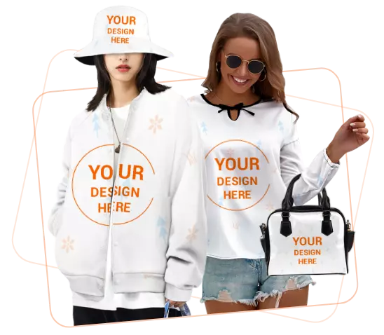
For print on demand sellers, the product base also matters. An all over print option, such as a men's all over print t-shirt, gives more room for color storytelling than a small front logo tee. If you manage sourcing across stores, a print on platform like Inkedjoy can fit into a broader workflow, while color testing still belongs at the sample stage.

Current guides on t-shirt and ink color combinations often highlight proven pairings, but the better decision is the one that matches your audience, design size, and sales channel. A combo that looks sharp in a studio mockup may need stronger contrast for mobile shoppers.
What to Evaluate Before You Pick Colors: Contrast, Fabric, Audience, and Print Method
Strong t shirt and ink color combinations start with one question: will the design still read clearly at a glance? Contrast matters more than personal taste. White ink on black usually works because the value difference is obvious. Mid tone ink on mid tone shirts often looks refined on screen but weak in product photos and even weaker in person.
Fabric changes color behavior. On 100% cotton, ink tends to look more stable and predictable. On heather blends, the mixed fibers soften both shirt color and print edges, which can mute fine detail. If your artwork uses thin lines or small type, test it on the actual fabric color, not just a digital mockup. A combo that looks clean on a solid tee may lose sharpness on a textured blend.
Audience should guide the risk level. If you sell broad casual styles, simple high contrast pairs are easier to merchandise and easier for shoppers to trust. If your brand leans fashion forward, lower contrast t shirt and ink color combinations can work, but only if the design is intentionally subtle and the product photos show that clearly.
| Factor | Safer choice | Higher risk |
| Contrast | Light on dark, dark on light | Tone on tone |
| Fabric | Solid cotton | Heather or textured blends |
| Print method | Simple art matched to method | Detailed art on unsuitable method |
Print method is the final filter. DTG handles complex color transitions well, while screen printing is often stronger for bold graphics with limited ink colors. One common mistake is choosing shirt colors first and checking print limitations later. Experienced sellers usually reverse that order.
10 Proven Color Pairings That Make Graphic Tees Look More Premium
Strong t shirt and ink color combinations usually come down to contrast, print method, and the tone you want the shirt to carry. Premium looking tees rarely rely on loud color alone. They use readable ink, controlled saturation, and shirt colors that support the artwork instead of competing with it.
| Pairing | Why it works | Watch for |
|---|---|---|
| Black tee + off white ink | Softer than bright white, more elevated | Fine lines can fill in on heavy prints |
| Vintage navy + cream | Classic retail look with lower glare | Can look dull on weak mockups |
| Forest green + tan | Earthy and understated | Less suited to high energy streetwear |
| Heather gray + black | Minimal and versatile | Low contrast for small text |
| Sand + dark brown | Looks considered, especially for lifestyle brands | Needs clean artwork edges |
Five more combinations consistently photograph well: faded black with muted red, natural cotton with olive, charcoal with light gray, dusty blue with white, and deep maroon with blush. These t shirt and ink color combinations work because they feel intentional in product photos and still read clearly on mobile.
A common mistake is choosing maximum contrast for every design. Black on white is clear, but not always premium. Softer white, cream, tan, or faded garment tones often look more refined. If your audience leans into bold graphics, high contrast still has a place. If you sell minimalist or boutique style designs, slightly muted t shirt and ink color combinations usually carry more value.
When Bold Beats Safe: How to Match Neutrals, Brights, and Specialty Inks
Strong t-shirt and ink color combinations depend less on trend names and more on contrast, audience, and printing method. Safe neutrals like black, white, heather gray, and natural usually convert well because they reduce decision friction. But bold color can outperform neutrals when the design is simple, the message is short, and the ink has enough separation from the shirt color to stay readable in a thumbnail.
A practical rule: if the artwork carries the product, use a neutral shirt. If the shirt color is part of the concept, go bolder and simplify the print. For example, white ink on forest green feels cleaner than a four color graphic on the same shirt. Likewise, bright tees such as orange or kelly green usually work better with one or two inks, not a crowded palette.
| Shirt type | Ink approach | Use it when |
|---|---|---|
| Neutral | High contrast or tonal | You want broad appeal and easier styling |
| Bright | Minimal inks with strong separation | The shirt color supports the design theme |
| Specialty ink | Use sparingly as an accent | You need texture, shine, or premium detail |
Specialty inks, including puff, metallic, or glow effects, are less forgiving. They can make t-shirt and ink color combinations more memorable, but they also raise production complexity and can distract from weak artwork. They fit limited collections, fashion focused niches, or creator merch better than evergreen basics.
The common mistake is choosing shirt and ink colors separately. Evaluate them at mockup size first. If the design disappears on mobile, the combo is not ready.
Common Color Mistakes That Make Printed Shirts Look Cheap or Hard to Read
Poor t-shirt and ink color combinations usually fail for one of three reasons: weak contrast, too many competing colors, or a color choice that ignores the shirt fabric. A design can look sharp on a bright screen and still print flat on cotton, polyester, or a blended tee. Before listing a shirt, judge the combo from the customer's viewing distance, not only from the design file.
| Mistake | Why it hurts the design | Better decision |
|---|---|---|
| Dark ink on dark shirts | Details disappear, especially in small text or thin line art. | Use white, cream, light gray, or a brighter accent ink. |
| Low contrast neutrals | Beige on heather gray can look muted rather than intentional. | Increase tonal difference or add a dark outline. |
| Too many ink colors | The shirt feels cluttered and may cost more to produce. | Limit most ecommerce designs to two or three ink colors. |
Small typography needs stricter contrast than large artwork. If the design uses slogans, dates, or brand names, test it at thumbnail size because shoppers often see product images first on mobile. This is especially important for dropshipping stores where the mockup may be the customer's only pre purchase reference.
Another common error is treating every black shirt the same. A washed black tee, a deep black hoodie, and a charcoal blend can shift the final look. For safer t-shirt and ink color combinations, pair dark garments with clean light inks, pair light garments with saturated dark inks, and reserve tone on tone looks for minimalist designs where subtlety is the point.
How to Test, Compare, and Launch the Best-Selling Option for Your Store in 2026
The fastest way to choose among t-shirt and ink color combinations is to test fewer options, with clearer rules. Most stores do better with three variants per design: one safe seller, one trend led option, and one higher contrast version for ad creative. More than that usually spreads traffic too thin and makes results harder to trust.
Start with a simple comparison set. For example, test black shirt with white ink, faded navy with cream ink, and sand shirt with dark brown ink. These cover three buying behaviors: obvious readability, softer lifestyle appeal, and fashion forward neutrals. If your audience buys statement graphics, contrast usually wins. If they buy giftable or boutique style products, muted combinations often get more saves and fewer returns tied to "looked different than expected."
| What to compare | Strong signal |
|---|---|
| Click through rate | Thumbnail color stands out fast |
| Conversion rate | Shirt and print match buyer expectations |
| Return or complaint rate | Ink tone looked accurate in real life |
Use the same mockup angle, lighting, and model style for every test. Changing presentation at the same time as color makes the data messy. This matters even more in 2026, when shoppers often compare products from image first surfaces before reading details.
A common mistake is launching only what the store owner likes. A better rule is this: keep the variant with the strongest profit after print cost, discount rate, and return risk, not just the highest clicks. That approach is especially useful for print on demand stores with limited ad budgets.
FAQs
Which t-shirt and ink color combinations usually sell best online?
High-contrast pairings usually perform best because the design is easier to read in thumbnails and ads. Black shirts with white ink, white shirts with black ink, navy with white, and heather gray with black are common top performers. The best choice still depends on your niche and artwork style.
How do I choose between light ink on dark shirts and dark ink on light shirts?
Start with visibility. Light ink on dark shirts often feels bolder and more premium, while dark ink on light shirts can look cleaner and more casual. If your design has thin lines or small text, pick the option that gives stronger contrast and better legibility.
Do certain shirt and ink pairings cost more to print in 2026?
Yes, they can. In 2026, darker garments may need an underbase for some print methods, which can affect print time, ink use, and final cost. Complex multi-color artwork also raises costs. Simple, high-contrast t-shirt and ink color combinations are often easier to price and scale.
What are the riskiest color combinations for returns or customer complaints?
Low-contrast combinations are the biggest risk because the printed design may look weaker in person than it did on screen. Neon inks, very dark ink on dark fabric, and subtle tone-on-tone prints can also create expectation issues. Always review mockups carefully and test real samples first.
Should I test multiple color combinations for the same design or focus on one winner?
Test a small set instead of uploading every possible option. Three to five strong combinations usually give enough data without overwhelming shoppers. Start with one safe bestseller, one niche-specific option, and one trend-driven variation, then cut weak performers based on clicks, conversion rate, and returns.
Read More from Inkedjoy Blog
Written by Aria
As an SEO strategist and Print-on-Demand expert, Aria helps POD brands grow by writing content that ranks and converts. Her strengths include keyword research, engaging blog posts, and persuasive product descriptions. She's always on the lookout for the next POD trend.