25 Best Fonts for T-Shirts for Print-on-Demand Sellers
You could have a wonderful and well-thought-out design with an excellent color scheme and a unique niche, and still fail if you only look at the font. One can only read a shirt in the snap of a finger. If the characters do not entice the reader at once, they are inclined to move on. Choosing the right font can be a deal maker or deal breaker at this split-second reflex point.
The best fonts for t-shirt printing are much more than good-looking ones. First of all, they need to be capable of producing a good print, remaining intact after many washes, and sounding like the kind of thing your audience would be into.
Below we share with you 25 fonts that are very popular, great pairings, and which print methods work best for the fonts.
What Makes a Great T-Shirt Font?
Fonts are not one-size-fits-all. Just because a font looks good on the computer screen does not mean it will be good on the fabric. Before loading a font to your cart, make sure that your font passes all of these five tests:
Legibility from a Distance
People usually read t-shirts from the other end of the room, not up close. A very thin serif and a delicate script can get blurred at the very first glance. Your writing must be understood right away — even from ten feet away.
Print Durability
Extremely fine details and hairline strokes may fade, crack, or bleed after the first few washes. Fonts with bold and solid letter forms will stay nice for much longer periods.
Scalability
The perfect t-shirt font performs well visually at 2 inches and at 12 inches. If a font behaves awkwardly when its size is changed, you'd better avoid it.
Visual Hierarchy
In case your design consists of different text parts — headline, tagline, date — your font has to help the reader see the order, i.e., what they should read first. Display fonts in bold pair naturally here with lighter body fonts to guide the eye.
Niche Alignment
Fonts have a soul of their own. A rough and hand-made typeface looks great for a camping brand, but will be out of place in the case of premium fashion merch. You always need to align the font to your audience.
25 Best Fonts for T-Shirt Design
These fonts are categorized by style to help you easily choose one that fits a specific niche perfectly. You'll find most of them on Google Fonts, with a few exceptions.
Montserrat
Montserrat is a polished, geometric sans-serif typeface that suits almost any niche well. It is particularly effective on simple designs, streetwear, and curved text configurations.
Best for: Minimalist designs, streetwear, curved text. Pair with: Lato or Roboto
Bebas Neue
The capitalized letters with thick vertical lines make Bebas Neue a very eye-catching typeface. It has become one of the top selections for street and sportswear brands across the globe.
Best for: Streetwear, statement tees, athletic wear. Pair with: Montserrat
Oswald
Oswald is a tall and thin sans-serif font that can be stacked nicely for logo-like layouts. Its slender width is perfect for designs with very little horizontal space.
Best for: Athletic designs, stacked headlines, logo-style text. Pair with: Montserrat
Inter
Inter is very sharp and highly identifiable. Brands wanting a clean and modern image without being too cold or corporate will find it a good fit.
Best for: Minimalist designs, tech, and lifestyle brands. Pair with: Libre Baskerville
Open Sans
Open Sans is very welcoming with a neutral tone and excellent legibility. It suits almost every design type where the message takes precedence over the style.
Best for: Event merch, charity tees, corporate swag. Pair with: Raleway
Anton
Anton is a heavy, narrow, display font that hits hard. It's great at commanding attention quickly, exactly what band merch and streetwear need.
Best for: Band merch, streetwear, attention-grabbing designs. Pair with: Roboto
Poppins
The rounded, geometric letterforms of Poppins give a fresh and friendly feel. It's a favorite among lifestyle brands that want to look modern without appearing aggressive.
Best for: Lifestyle branding, modern logo tees. Pair with: Source Serif Pro
Work Sans
Work Sans is kind of a hybrid between professional and artistic. It is highly legible at all sizes and can be combined with serif fonts to achieve a well-rounded, editorial appearance.
Best for: Creative studio tees, startup merch. Pair with: Cormorant
Raleway
Raleway features exquisite strokes varying from thin to thick that give this typeface a sophisticated, modern style. It is a good choice if you want something minimal yet unique.
Best for: Minimalist and contemporary designs. Pair with: Open Sans
Shrikhand
Shrikhand is a display font that makes use of a bold, somewhat unusual style to bring back the retro vibe. It blends very well with Y2K revivals and other nostalgic brand looks.
Best for: Retro designs, Y2K aesthetics. Pair with: News Cycle or Montserrat
Titan One
If you're looking to add some big character and fun, bubbly vibes to your designs, then Titan One is a great choice for you. This font enhances designs that are playful and in need of weight but not seriousness.
Best for: Y2K designs, playful cartoon aesthetics. Pair with: Open Sans
Bungee
The inspiration behind Bungee is the signage of the urban environment. The font's letters, having a blocky and architectural nature, make it an excellent choice for a bold and street-inspired apparel line.
Best for: Bold streetwear-inspired designs. Pair with: Open Sans or Arvo
Alfa Slab One
Alfa Slab One is a very strong slab serif that is geared toward making an impact at large sizes. It is great for when your graphic is meant to dominate a t-shirt back print or make a team name highly visible.
Best for: Team names, event merch, large-format back prints. Pair with: Lato
Ultra
Ultra is a fat, hefty serif typeface that is really good for old-school layering and drop-shadow effects. It imparts a certain character of vintage posters that grabs attention even on social media feeds.
Best for: Retro layering and shadow effects. Pair with: Roboto
Graduate
Graduate looks a lot like the old-school collegiate letterings. It delivers a sporty and nostalgic vibe right away that is a great match for school shirts and athletic collections.
Best for: Classic, sporty designs, school shirts. Pair with: Lato or Roboto
Playfair Display
Playfair Display is a dramatic contrast serif that owes its heritage to the world of newspapers. The qualities of exclusiveness and style it bestows upon designs are in line with high-end fashion and expensive items.
Best for: Premium apparel, editorial designs, and formal events. Pair with: Inter
Abril Fatface
Inspired by the heavy typefaces used in advertising in the 19th century, Abril Fatface gives any design a sense of drama and a strong presence.
Best for: Bold headlines, high-end fashion. Pair with: Roboto or Oswald
Libre Baskerville
Libre Baskerville is a version of a timeless serif optimized for the web. In design, it conveys a scholarly, trustworthy atmosphere while still being refreshed and modern in appearance.
Best for: Academic designs, classic brand merchandise. Pair with: Montserrat
Source Serif 4
The Source Serif 4 has a very neat and editorial feel to it. For the designs that are very text-heavy, this typeface will really stand out due to its balance of style and readability.
Best for: Editorial apparel, text-based designs. Pair with: Work Sans
Pacifico
Pacifico is a vintage-style, slightly cursive font that also has a carefree beach-town kind of vibe. It is the one most favored for summer collections and casual lifestyle brands.
Best for: Beachwear, summer collections, fun designs. Pair with: Figtree or Open Sans
Sacramento
Sacramento is a delicate, elegant script font that looks very much like a stylishly handwritten letter. It is most effective when it is used in larger sizes, and it is simply stunning on feminine clothing.
Best for: Elegant, feminine designs. Pair with: Montserrat
Lobster
Lobster has grown into one of the most popular script typefaces on the internet. Its large and bold character-to-character connection is so good that it remains pretty legible even at smaller points — something most script fonts hardly ever manage.
Best for: Special occasions, fashion-forward audiences. Pair with: Open Sans
Amatic SC
With its hand-made look and slightly off-kilter style, Amatic SC feels like an artisan and human touch. It is simply ideal for nature, outdoors, and craft-inspired brands.
Best for: Nature themes, outdoorsy designs, arts and crafts. Pair with: Crafty Girls or Oswald
Permanent Marker
Permanent Marker is just like its word — raw, edgy, and very real. It is appropriate for designs that convey DIY and protest-poster styles.
Best for: Gritty designs, textured aesthetics. Pair with: Roboto or Lato
Patrick Hand
Patrick Hand is an informal font that is happy, lively, and quite informal. It is suitable for designs that focus on family, kids' shirts, and cheerful slogans.
Best for: Cheerful slogans, family reunion tees, kids' designs. Pair with: Josefin Sans
Match Fonts to Your Printing Method
Not only does the font you select influence the design's appearance, but it also affects its printing quality. Since every printing technique has its own set of restrictions, it is wise to check them out before making a decision.
DTG (Direct-to-Garment)
DTG printing is great when it comes to handling intricacies and color blending. Basing your decision on a design featuring cursive fonts or sharp-serif fonts is only going to reward you with the final product that is close to your expectations. However, the thinnest parts of your letters on dark-colored garments will likely require the use of the white layer, which might soften the edges a bit. All in all, for the purest results, go for fonts with a decent stroke weight.
DTF (Direct-to-Film) / DTFlex
DTF printing is very flexible when it comes to printing detailed fonts and, in fact, can print them better than most other methods. Thin details, complex script fonts, and very small letters all produce clean prints. It is, indeed, one of the most font-friendly printing processes out there.
Embroidery
When it comes to embroidery, keeping the font in mind is critical. The fact of the matter is that most letter styles are not suitable for digitizing, e.g., thin serifs, script, or delicate letterforms. Here is what you need:
- Simple letter-shaped block fonts without a lot of detail
- Capital letters need to be larger than 0.25 inches
- Fonts similar to Bebas Neue, Anton, Graduate, and Alfa Slab One
- For embroidery purposes, avoid script fonts and very thin display fonts altogether
Screen Printing
Screen printing rivals in efficacy mostly on simple, high-contrast designs. Also, since each color corresponds to the creation of a separate screen, complex fonts featuring gradient or shadow effects will increase your expenses. The ideal fonts for screen printing are generally characterized by:
- Well-defined spaces separating letterforms
- Complete lack of hairline strokes
- Bold and thick letters
Examples of such fonts are Bebas Neue, Oswald, Anton, and Bungee.
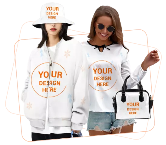
Turn Your Font Choice into Real Profit with Inkedjoy
Choosing the right font is just one part of the equation. Another major part is making the font exactly in the way you envisioned it during the designing process — and that's why your print-on-demand partner is so important.
Inkedjoy provides print-on-demand sellers not only access but also a whole range of tools and technology that allow them to create great designs at a large scale, including:
- Top-notch DTG and DTF printing technology — Inkedjoy is equipped with high-end printing machines that accurately replicate fine text, heavy display fonts, and intricate scripts. What you see on your screen is exactly what you get on the shirt.
- Mockup Generator — Inkedjoy offers a mockup generator tool, with the help of which you can visualize the impact of your font style when it is printed on a real garment. This practice is a brilliant time saver and error preventative.
If you plan to focus on print-on-demand, mastering your fonts and collaborating with a reliable partner for printing is among the key factors that differentiate those sellers who grow and those who stagnate.
Conclusion
An ideal font for a t-shirt not only comes through good looks on a screen, but also through the ability to survive the printing process, being suitable for your niche, and helping the customers get in touch with your brand almost instantaneously. Bebas Neue, being simple and bold, and Amatic SC, with a handmade touch, are just two of the fonts listed that have a really unique feature to offer.
You may choose one or two fonts that represent your niche, see how they perform with your designs, and then gradually make them consistent.
If you want to get started with these fonts, go to Inkedjoy, where you will be able to print your designs using professional equipment.
FAQ
Which font is the best for a t-shirt?
For the safest options, start with Montserrat and Bebas Neue. Montserrat is versatile enough to be used for minimalist and lifestyle brands.
Is it allowed to use freeware fonts for commercial t-shirt printing?
Yes, but you must check the license. Most Google Fonts are distributed under the SIL Open Font License (OFL), which is compatible with commercial use. However, some fonts are free for personal use only.
What are the best fonts for screen printing?
The best ones are bold, solid fonts with clean edges. For example, Bebas Neue, Anton, Oswald, and Bungee belong to this category.
Is it possible to use script fonts on t-shirts?
Yes, but it depends on the size of the font. Script fonts like Pacifico and Lobster are perfectly legible in large sizes. But when they are made small, they are difficult to read.
Read more
Written by
CMO from EPROLO. With over 10 years of e-commerce experience, Carry specializes in dropshipping, website operation, and marketing strategies. She provides actionable insights that help online sellers grow, optimize their stores, and succeed in a competitive marketplace.
Editorial note: This content is based on verified Inkedjoy print-on-demand context, including apparel workflows, mockup creation, store integrations, dropshipping, and made-on-demand fulfillment. Product availability, fabric details, integrations, production methods, shipping options, and fulfillment settings may change. Sellers should verify current product and fulfillment options inside the Inkedjoy dashboard before publishing or promoting products. No earnings, delivery, or production outcome is guaranteed.